WEEK 01

WHY STUDY COLOR THEORY?
If you are involved in the creation or design of visual documents, an understanding of color will help when incorporating it into your own designs. Choices regarding color often seem rather mystical, as many seem to base decisions on nothing other than "it looks right." Although often told I had an eye for color, the reason why some colors worked together while others did not always intrigued me and I found the study of color theory fascinating.
COMMUNICATING COLOR
What is red? Candy apple red, blood red, ketchup red, rose red... to try and communicate a specific hue is difficult without some sort of coding system. Early in the 1900's, Albert Munsell, a professor at an art school in Boston developed a color system which offered a means to name colors. With a published system, people could be specific about which red they were referring. Munsell's system has been reworked for today's use with the Pantone color system, TRUEMATCH, CIE systems and others.
COLOR APPLICATION
With respect to the arts, color was part of the realistic, visual representation of form, but one group of painters abandoned the traditional practices regarding color in painting. This group of artists were influenced by Cezanne, Van Gogh, and Gauguin. Led by Henri Matisse, they were known as the Fauves, or "the wild beasts." Their exuberant use of brilliant hues seem to disregard imitative color. Whereas other artists had used color as the description of an object, the Fauves let color become the subject of their painting. A painting in the "Fauvist Manner" was one that related color shapes; rather than unifying a design with line, compositions sought an expressiveness within the relationships of the whole. This turn from tradition brought an integrity to color in that color was regarded on its own merit.
Images of Fauves
|
|

|

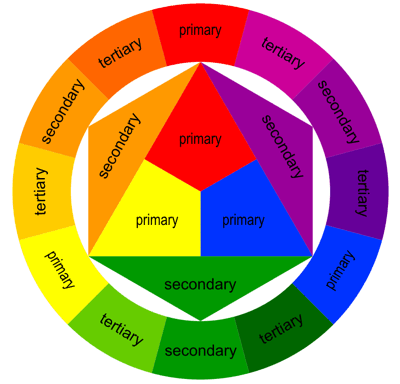
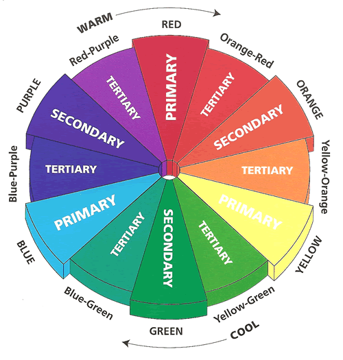
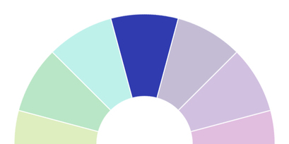
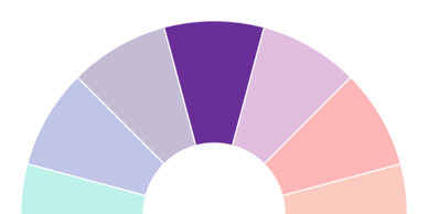
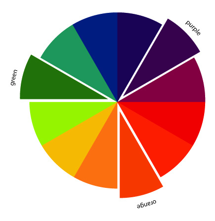
Color Relationships: Primary, Secondary, Tertiary Primary colors
Remember that blue, red and yellow are all primary colors because you mix them to create other colors. The primary colors are always equal distance from each other on the color wheel, as you can see above.
Secondary colors
Secondary colors are made by mixing equal parts of two primary colors. Notice that the secondary colors are always between two primary colors — the two primary colors that make up the secondary color.
On the color wheel above, the secondary color green is located between blue and yellow. If you mixed one part blue and one part yellow, you’ll get green.
Orange is the secondary color located between red and yellow. If you mix one part red and one part yellow, you’ll end up with green.
Tertiary colors
Tertiary colors are situated on the color wheel between a secondary color and a primary color. If you mix equal parts of the secondary color and primary color, you’ll get that tertiary color. You can also make tertiary colors by mixing two secondary colors.
Check out our pretty color wheel again. See the tertiary color blue-green? That’s created when you mix — you guessed it — primary color blue with secondary color green.
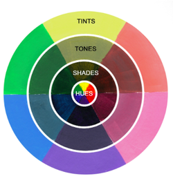
Hues
Hues, Tints, Tones and Shades: What’s the Difference?
A lot of us use the terms hue, tint, tone and shade when referring to color in art, but did you know each of these terms has a very specific meaning? For a painter, knowing the difference between them all is important when communicating concepts in your painting. More importantly, you can use this knowledge for color mixing, helping you figure out how to mix just the right colors from your paints.
Hue is a term that seems more complicated than it is. A hue is just a color. More specifically, a hue is any color on the color wheel. Hopefully you’re familiar with the color wheel, but let’s go over it quickly if you need a refresher. There are three primary colors, red, blue and yellow. Most of us also know that combining any two of those primary colors will give you one of the secondary colors: red and blue make violet, yellow and blue make green, and red and yellow make orange. A third set of colors, the tertiary colors, fill in the six gaps between the primary and secondary colors– red-orange, blue-green, red-violet and so on. Tertiary colors are pretty simple to figure out based on their names, so we won’t cover them here.
Tints, tones, and shades are variations of the hues found on the basic color wheel when white, black or both are mixed in.
- Hue: A "hue" is the color itself - so green, blue, red, purple, etc.
- Tint: A "tint" is when *white* is added to a hue, making that hue lighter.
- Shade: A "shade" is when you instead add *black* to a hue, making it darker.
- Tone: A tone is created when *grey* is added to a hue.
- Intensity: The strength of a color such as bright or dull
- Value: The lightness or darkness of a color
Color Harmony
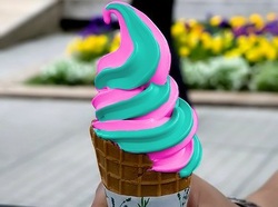
Harmony can be defined as a pleasing arrangement of parts, whether it be music, poetry, color, or even an ice cream sundae.
In visual experiences, harmony is something that is pleasing to the eye. It engages the viewer and it creates an inner sense of order, a balance in the visual experience. When something is not harmonious, it's either boring or chaotic. At one extreme is a visual experience that is so bland that the viewer is not engaged. The human brain will reject under-stimulating information. At the other extreme is a visual experience that is so overdone, so chaotic that the viewer can't stand to look at it. The human brain rejects what it can not organize, what it can not understand. The visual task requires that we present a logical structure. Color harmony delivers visual interest and a sense of order.
In summary, extreme unity leads to under-stimulation, extreme complexity leads to over-stimulation. Harmony is a dynamic equilibrium.
WEEK 2
Understanding the Qualities and Characteristics of Color


|
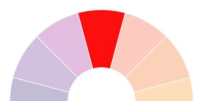
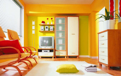
Red
A part of the warmer color family, the primary color red is a strong, emotionally-intense color. Naturally enhancing the metabolic rate in people, it has also been shown to increase respiration rates and blood pressure when people are exposed to it. It's used in traffic systems a lot (think road signs and traffic lights) as red is a high-visibility color which has plenty of impact. Some associations of the color red include:
|
What is interesting about red is how it has two almost-direct opposite associations: love and war. Due to red being known as a high-impact color that often represents danger, it's also associated with many memorable war images. However, red is known quite heavily for love and matters of the heart - with varying shades of red (from stronger, darker colors to lighter variations such as pink) being heavily associated with Valentine's Day in Western culture.
In other cultures, red has completely different meanings. In China, red is associated with both prosperity and happiness, as well as being a symbol of good luck. In India, red represents purity and is then often used as a color used in many weddings. However, in South Africa red is the color used most in mourning.
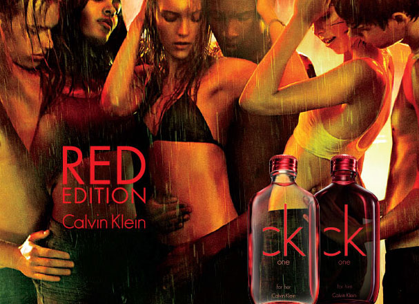
When using red, it's often wise use it more as an accent color than a focal color for the whole of a website. While in some situations it works well as the main focal color, most of the time using too much red in a design can cause feelings of irritation, agitation and even anger. However, using too little red can also create a feeling of cautiousness and manipulation.
Owing to these two extremes, it can be quite difficult using red to build the right balance. However, using red as an accent color - particularly on features that you want to enhance or make particular note of, such as buttons or other elements that push a user to make a decision - can be quite effective.
In other cultures, red has completely different meanings. In China, red is associated with both prosperity and happiness, as well as being a symbol of good luck. In India, red represents purity and is then often used as a color used in many weddings. However, in South Africa red is the color used most in mourning.
When using red, it's often wise use it more as an accent color than a focal color for the whole of a website. While in some situations it works well as the main focal color, most of the time using too much red in a design can cause feelings of irritation, agitation and even anger. However, using too little red can also create a feeling of cautiousness and manipulation.
Owing to these two extremes, it can be quite difficult using red to build the right balance. However, using red as an accent color - particularly on features that you want to enhance or make particular note of, such as buttons or other elements that push a user to make a decision - can be quite effective.
|
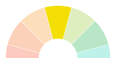
Yellow
The last of the main warm colors, yellow is a bright, creative color. Known for its ability to promote clear thinking and quick decision making, yellow is probably most associated with happiness, positive energy and sunshine. Some associations of the color yellow include:
|
Yellow, one of the three primary colors, is seen chiefly as a happiness-invoking, creative color and can therefore be used effectively to create designs that evoke feelings of happiness and clarity.
A very energetic color, yellow also has a degree of activity that it can pass along in your designs. You can use yellow to create enthusiasm and enhance areas in your design that need action to be taken.
In other cultures yellow has wildly different associations and meanings. In Egypt, yellow is widely used as the color for mourning and in the Middle Ages, yellow clothing was worn to signify those that had died. In India, yellow is a color that is often used by merchants. And in Japan, yellow is a symbol of courage and therefore has positive associations.
When designing with yellow, you need to be aware that using too much yellow can sometimes introduce feelings of anxiety - due to it being such a bright, "fast-moving" color too much yellow can lead to an unbalanced feel for your website. Instead, try to introduce other colors alongside yellow and use yellow as a highlight on a page, to lend focus to the more important aspects of a design.
However, due to the effects yellow has on a person (going back to the "fast-moving" sense it appears to offer), you can sometimes use yellow to your advantage - for example, yellow appears to induce quicker decision making and therefore having yellow buttons in e-commerce designs may work extremely well - as long as it is in fitting with the rest of your design.
Due to yellow feeling quite unstable it wouldn't be a good idea to use yellow in a website where you want to invoke a feeling of stability or security. It also seems that historically men perceive yellow to be a childish color, so it wouldn't be a good color choice for men's product websites - though it would be right at home when used for a younger audience.
Protecting the environment for future generations has been a growing focus for corporate social responsibility.

Green is the traditional color in Islam and is also mentioned in a good light a lot in the Quran
|
Green
Belonging to the cooler family of colors, green is a rejuvenating color and is often described as a natural peacemaker, due to its many associations with relaxing aspects of nature. Some associations of the color green include:
|
A combination of blue and yellow, green offers the mental clarity and enthusiasm of yellow mixed with the more emotionally calm and stable blue. In nature, we see green around us all the time - in leaves, grass, flowers and much more. Because of this, a lot of the associations we have with the color green are related quite heavily to nature and similar themes such as rebirth and fertility.
Green is often referred to as a color that offers a sense of stability and balance. It could therefore work well to use green in designs where you want to show how a product or service is reliable or safe to use.
On the other side of the coin, green also has lots of associations with jealousy, envy, and possessiveness - so you need to be careful about how you use the colors and ensure you use green more to add balance to a design.
Green has strong links with the recycling market, with green being used in the major recycling logos in the UK and Europe alone. Therefore, it makes sense to use green in designs that relate to recycling or any "green" product, service or company.
In other cultures, green generally has good connotations. In Ireland, as well as appearing on the national flag, it's a color that is heavily associated with St. Patrick's Day. Green is also the color of the lucky four-leaf clover, which is probably the most well-known symbol of luck in the world. Green is the traditional color in Islam and is also mentioned in a good light a lot in the Quran, with many of those in Paradise described as wearing "green garments".
The color was used on the cover of Tiffany's Blue Book, first published in 1845. Since then Tiffany & Co. has used the color extensively on promotional materials, including boxes and bags. The color is produced as a private custom color by Pantone, with PMS number 1837,
|
Blue
The coolest of all the main colors, blue is often seen as a very reliable and tranquil color, most likely due to the most obvious association of blue with the sea and the sky. A conservative color, it is often used well in designs that represent cleanliness and an air of responsibility. Some associations of the color blue include:

|
The final of the primary colors (alongside red and yellow), blue is a stress-reducing color that is often used in designs for masculine and corporate audiences. Blue is a color that invokes the feeling of trust, honesty and security and therefore lends itself well in particular to designs for products, services or companies that want to evoke those feelings in their audiences.
With its many associations with both the sky and the sea, blue also works well on designs that want to quite heavily promote those things. For example, if a product relates heavily to the sea (a surfing product, for example) then blue can be used to bring out those familiar feelings relating to the sea and help the audience relate to the product or website more. The same can be said for any colors that relate to actual, real things - such as anything in nature, like grass or flowers.
Blue is also known to be an appetite suppressor, so it wouldn't be a suitable color to use in designs that involve food in some way. You also need to be aware how using too much blue can be stifling and can almost seem old-fashioned, depending on the shades used.
Some of the best times to use blue in your designs will be for websites that are focused on masculine audiences and also for corporate businesses. That isn't to say you can't use blue on other styles of design - don't be afraid to experiment and have fun with using colors where you might not expect them.
Like with the general associations, there are many different connotations that come with the color blue in different cultures as well. In the Western culture, there is the "something blue" tradition, often used in weddings where the bride is offered something blue (as well as the other traditional "something old" and "something new") as a token of good luck in her new married life. However, in Iran, blue is the color that is used in mourning.
|
Violet/Purple
The last of the cooler color family, purple is seen as quite a mysterious color, usually representing ambition, royalty and power. Some associations with the color purple include:
|
A good combination of both red and blue, purple is intriguing and has both the calming, tranquil effect of blue and the energy that red offers. Purple is often seen as a color of luxury and works well in designs that need to show that bit more of an extravagant edge to it.
Unlike blues and greens, purple is a rare color to come across in nature. For example, purple flowers such as lilies, orchids and lavender are rare to come across but are very fragile and delicate, yet very precious and treated with great respect.
Purple is a popular culture in many cultures, for many different reasons. In Thailand, purple is the color of mourning for widows whereas in Egypt, it is known widely as the favourite color of Cleopatra, who was the last pharaoh of Ancient Egypt. In many other cultures, purple is the traditional color worn by royalty or people with authority. And in the US, there is the "Purple Heart", a significant US Military decoration awarded in the name of the President to those wounded or killed in battle.
When using purple, you need to be careful of using it too much - while certain amounts can definitely promote a more majestic, extravagant or luxurious feel to your design too much purple can also irritate and has even been heard to aggravate depression in some people.
It has been found that most children prefer the color purple to other colors, so it would likely be a really effective color to use in your designs that have a younger audience.
Using purple in your designs can be used to boost imagination or creativity and lighter shades of purple also work really well in feminine designs.

|
|
WEEK 3
Color Schemes
Color schemes are an arrangement of colors that, once put together, can be used in any form of design - including your designs on the web. It's hard work to come up with a good color scheme - and it's easy to notice when colors feel or seem "off" or not quite right. However, when you do make the effort to create a good and effective color scheme - and you put it to good use - this will make all the difference between a good design and one that is mediocre.
There are a few main color schemes, including: monochromatic, analogous, complementary and split complementary.

Monochromatic
Monochromatic color schemes use one hue (such as blue) and then use various tints or shades of that original color.
These are the easiest color schemes to create as it only involves the one hue - so you know that the few base colors you choose will work in harmony with one another.
Monochromatic color schemes use one hue (such as blue) and then use various tints or shades of that original color.
These are the easiest color schemes to create as it only involves the one hue - so you know that the few base colors you choose will work in harmony with one another.

Analogous or Harmonious Pair Scheme
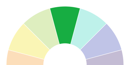
Analogous color schemes are created by choosing hues that are next to each other on the color wheel. So, for example, blue-green, green and yellow-green.
Simply choose any color as your main Mother Color. Then select two or three colors on either side of it. They all share similarities at their root and will be fairly easy to harmonize.

Complementary
Complementary color schemes are created by choosing two colors that are opposites on the color wheel - for example, red and green or purple and yellow. Because of these colors being exact opposites, they offer extremely high contrast and have a high impact.
Complementary color schemes can be hard to pull off for this reason and work better when you have elements of a design you want to stand out, rather than using them in fuller doses across the whole of a design.

Split Complementary
Split complementary color schemes are created by taking one color and then taking the two colors that are either side of what would be the first colors complementary.
For example, if your main color is purple, then your other two colors will be either side of the purple's complementary color yellow - so yellow-green and yellow-orange.
As this color scheme is quite close to the complementary color scheme, it is still going to have quite the impact when used, though it can feel a little more balanced and calmer than full-on complementary schemes. Again, when using a split complementary color scheme it is easier to use one of the colors as the main focus, with the other two colors being used as an accent.
|
Triadic or Triad Color Scheme
The triadic color scheme uses three colors equally spaced around the color wheel. This scheme is popular among artists because it offers strong visual contrast while retaining balance, and color richness. The triadic scheme is not as contrasting as the complementary scheme, but it looks more balanced and harmonious. |

Tetradic Color SchemeThe tetradic (double complementary) scheme is the richest of all the schemes because it uses four colors arranged into two complementary color pairs. This scheme is hard to harmonize; if all four colors are used in equal amounts, the scheme may look unbalanced, so you should choose a color to be dominant or subdue the colors.
CREATIVE COLOR SCHEMES FOR DESIGNER
WEEK 4
COLOR SYMBOLISM THEORIES
|
COLOR CONVEYS MEANINGS IN TWO PRIMARY WAYS- NATURAL ASSOCIATIONS AND PSYCHOLOGICAL SYMBOLISM. NO, IT’S NOT MIND CONTROL. THE TRUTH OF THE MATTER IS THAT PEOPLE ARE COMFORTABLE WHEN COLORS REMIND THEM OF SIMILAR THINGS. FOR EXAMPLE, A SOFT SHADE OF BLUE TRIGGERS ASSOCIATIONS WITH THE SKY AND A PSYCHOLOGICAL SENSE OF CALM.
SUCCESSFUL DESIGN REQUIRES AN AWARENESS OF HOW AND WHY COLORS COMMUNICATE MEANING. THE SOURCE OF THESE MEANINGS CAN BE QUITE CONSPICUOUS, SUCH AS THOSE FOUND IN NATURE — RED IS THE COLOR OF BLAZING FIRE AND BLOOD, BLUE THE COLOR OF COOLING WATERS AND THE SKY. OTHER MEANINGS MAY BE MORE COMPLEX AND NOT UNIVERSAL. AS A STARTING POINT, THE COMMUNICATIVE PROPERTIES OF A COLOUR CAN BE DEFINED BY TWO CATEGORIES: 1. NATURAL ASSOCIATIONS 2. PSYCHOLOGICAL (OR CULTURAL) ASSOCIATIONS 
|
> Natural Associations

Occurrences of colors in nature are universal and timeless. For example, the fact that green is the color of vegetation and that blue is the color of the sky and water has been a reality since the dawn of humanity. These color associations are common to all people. Therefore, this symbolism is both timeless and universal. > Psychological or Cultural Associations

Color may generate another level of meaning in the mind. This symbolism arises from cultural and contemporary contexts. As such, it is not universal and may be unrelated to its natural associations. For example, green’s associations with nature communicate growth, fruitfulness, freshness and ecology. On the other hand, green may also be symbolic of good luck, seasickness, money and greed — all of which have nothing to do with green plants. These associations arise from a complex assortment of sources.
Furthermore, color may have both positive and negative symbolism. For example, although blue is the beautiful color of the sky on a sunny day, it can be symbolic of sadness or stability. Idiomatic American English reflects these traits in phrases such as “singing the blues” and “blue chip stocks.” Red is another example of dual symbolism. On one hand, as the color of fire and blood, it is an energizing, aggressive and bold color. In direct contrast, red is used for “STOP” signs throughout the world today. 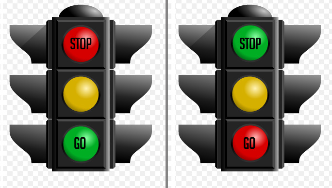
|
Color Symbolism Influences

There are several factors that influence the symbolism of a color:
1. The specific shade (variation) of a color
Dark and light shades of any color convey completely different meanings. For example, pink (light red) loses all of red's associations with energy and takes on new connotations of tenderness and sweetness. Likewise, dark blue is dignified and authoritative, sky blue is ethereal and softer.
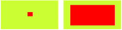
2. The quantity and placement of the color
Colors deliver the most powerful symbolism when used in large areas.
Colors deliver the most powerful symbolism when used in large areas.

3. The shape or object the color occupies
Symbolism becomes more complex when a color is used in combination with a basic shape.
Symbolism becomes more complex when a color is used in combination with a basic shape.

4. The color combination
Colors take on new meaning when combined with other colors.
For example, red and green are the colors of Christmas in Western cultures.
Colors take on new meaning when combined with other colors.
For example, red and green are the colors of Christmas in Western cultures.
ARE BLACK & WHITE COLORS? IS BLACK A COLOR?
IS WHITE A COLOR?
IS WHITE A COLOR?

The answer to the question - "Are black and white colors?" - is one of the most debated issues about color. Ask a scientist and you'll get a reply based on physics: “Black is not a color, white is a color.” Ask an artist or a child with crayons and you'll get another: “Black is a color, white is not a color.” (Maybe!)
There are four sections on this page that present the best answers.
There are four sections on this page that present the best answers.
INTRODUCTION: HOW COLORS EXISTTHE FIRST ANSWER: COLOR THEORY
#1 - COLOR AS LIGHT
BLACK IS NOT A COLOR. WHITE IS A COLOR.
THE SECOND ANSWER: COLOR THEORY
#2 - COLOR AS PIGMENT OR MOLECULAR COLORING AGENTS
BLACK IS A COLOR. WHITE IS NOT A COLOR
THE THIRD AND MOST COMPLETE ANSWER: VISION AND REFLECTION
#1 - COLOR AS LIGHT
BLACK IS NOT A COLOR. WHITE IS A COLOR.
THE SECOND ANSWER: COLOR THEORY
#2 - COLOR AS PIGMENT OR MOLECULAR COLORING AGENTS
BLACK IS A COLOR. WHITE IS NOT A COLOR
THE THIRD AND MOST COMPLETE ANSWER: VISION AND REFLECTION
A BASIC UNDERSTANDING OF HOW COLORS ARE CREATED IS THE FIRST STEP IN PROVIDING CORRECT ANSWERS. HERE ARE TWO EXAMPLES:

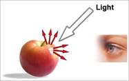
The color of a tangible object is the result of pigments or molecular coloring agents. For example, the color of a red apple (in the illustration at the left) is the result of molecular coloring agents on the surface of the apple. Also, a painting of a red apple is the result of red pigments used to create the image.
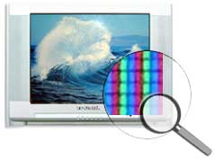
The colors of objects viewed on a television set or on a computer monitor are the result of colored light (in the illustration at the right). If you're not familiar with how colors are created by light, look at your monitor or television screen close up. Put your eye right up against the screen. A small magnifying glass might help.
A simplified way to explain it is that the color of a red apple on a computer or television is created by photons of red light that are transmitted within the electronic system.
A simplified way to explain it is that the color of a red apple on a computer or television is created by photons of red light that are transmitted within the electronic system.
Vision and Reflection
The final answer to whether black and white are colors takes other factors into consideration.
Colors exist in the larger context of human vision. Consider the fact that there are three parts to the process of the perception of color.
1. The medium - The color as it exists as a pigment/colorant (such as the color of a tangible object) or as light (such as the color of an image on a television screen).
2. The sender - How the color is transmitted.
3. The receiver - How humans see color. In other words, how we receive information about color.

The color of a tangible object originates as a molecular coloring agent on the surface of the apple. We see the color of an object because that object reflects “a color” to the eye. Every color is the effect of a specific wavelength. Link to ElecroMagnetic Color at Color Matters.
In the case of the apple, we see the color red because the red apple reflects the specific wavelength of red (640nm is red).
The same theory applies to black and white.
The question:
Are black and white colors?
The answer:
1. Black is not a color; a black object absorbs all the colors of the visible spectrum and reflects none of them to the eyes.
The grey area about black:
- A black object may look black, but, technically, it may still be reflecting some light. For example, a black pigment results from a combination of several pigments that collectively absorb most colors. If appropriate proportions of three primary pigments are mixed, the result reflects so little light as to be called "black." In reality, what appears to be black may be reflecting some light.
- In physics, a black body is a perfect absorber of light.
In conclusion, the colors we see are simply a degree of how much of this color present in light is reflected. To be completely accurate, a color reflects the wavelengths in the NM range that our retinal cones respond to.
The medium is the process of reflection of the wavelength of the color.
The receiver is our eyes which receive the wavelength of the color.
The medium is the process of reflection of the wavelength of the color.
The receiver is our eyes which receive the wavelength of the color.
WEEK 5

Color Design and Psychology for Branding
Brands and color are inextricably linked because color offers an instantaneous method for conveying meaning and message without words.
Branding is a word commonly referred to by advertisers and marketing people, but what does it actually mean? Marketing experts define "brand" as the "name, term, sign, symbol or design, or a combination of them intended to identify a company's products or services." In other words, a brand communicates the "idea" of company or product. This is what forms the connection with consumers.
The Power of Images
A single image delivers a lot of information in a very short time because we perceive an image all at once, whereas reading or hearing often takes significantly longer to process the same information.
A recent study found that images of brands trigger religious reactions. (Source) Dr. Gemma Calvert discovered that when people viewed images associated with the strong brands— the iPod, the Harley-Davidson, the Ferrari, and others— their brains registered the exact same patterns of activity as they did when they viewed the religious images.
The Power of Shapes and ColorsBrands communicate meanings with the language of color and shape. As the overused cliché says, "A picture is worth a thousand words."
There are natural — or universal — associations evoked by shapes and colors that are common to all of us: For example, a horizontal line is stable and a diagonal line is dynamic. Red is hot and full of fire, blue is cool and watery — or intangible like the sky.
About Shapes
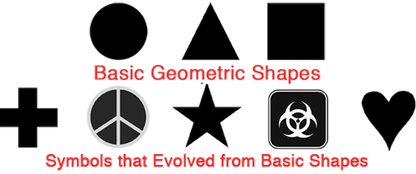
Colors and shapes work in harmony with each other to communicate. Therefore, an understanding of shapes is essential to understanding the power of color in branding.
Even the most basic geometrical shapes can be soft or hard, stable or threatening. The image below illustrates basic geometric shapes and contemporary symbols that evolved from basic shapes.
Brands and color are inextricably linked because color offers an instantaneous method for conveying meaning and message without words.
Branding is a word commonly referred to by advertisers and marketing people, but what does it actually mean? Marketing experts define "brand" as the "name, term, sign, symbol or design, or a combination of them intended to identify a company's products or services." In other words, a brand communicates the "idea" of company or product. This is what forms the connection with consumers.
The Power of Images
A single image delivers a lot of information in a very short time because we perceive an image all at once, whereas reading or hearing often takes significantly longer to process the same information.
A recent study found that images of brands trigger religious reactions. (Source) Dr. Gemma Calvert discovered that when people viewed images associated with the strong brands— the iPod, the Harley-Davidson, the Ferrari, and others— their brains registered the exact same patterns of activity as they did when they viewed the religious images.
The Power of Shapes and ColorsBrands communicate meanings with the language of color and shape. As the overused cliché says, "A picture is worth a thousand words."
There are natural — or universal — associations evoked by shapes and colors that are common to all of us: For example, a horizontal line is stable and a diagonal line is dynamic. Red is hot and full of fire, blue is cool and watery — or intangible like the sky.
About Shapes
Colors and shapes work in harmony with each other to communicate. Therefore, an understanding of shapes is essential to understanding the power of color in branding.
Even the most basic geometrical shapes can be soft or hard, stable or threatening. The image below illustrates basic geometric shapes and contemporary symbols that evolved from basic shapes.
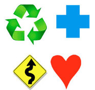
The Power of Color
Our minds are programmed to respond to color. For example, we stop our cars for red lights and go on green.
Consider the effects of color in the image of contemporary symbols on the right.
Our minds are programmed to respond to color. For example, we stop our cars for red lights and go on green.
Consider the effects of color in the image of contemporary symbols on the right.

The Power of Color for Brands
Brands and color are inextricably linked because color offers an instantaneous method for conveying meaning and message without words.
Color is the visual component people remember most about a brand followed closely by shapes/symbols then numbers and finally words. For example, the real McDonald's is easy to detect in the image on the right.
Many of the most recognizable brands in the world rely on color as a key factor in their instant recognition. (See for yourself and take the "Recognizable Brands Test" at the end of this article.)
Why Color Matters Facts
Research has reinforced that 60% of the time people will decide if they are attracted or not to a message - based on color alone!
Color increases brand recognition by up to 80 percent. (Source: University of Loyola, Maryland study)

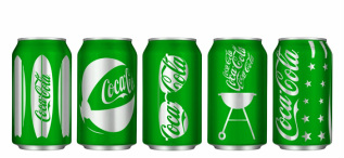
Examples of Color Branding
1. Natural and Universal Color Symbolism for Brands
FedEx's two different color schemes are the best examples of the "universal" symbolism of colors. Green communicates ground services; orange communicates the high energy and speed of air transportation.
1. Natural and Universal Color Symbolism for Brands
FedEx's two different color schemes are the best examples of the "universal" symbolism of colors. Green communicates ground services; orange communicates the high energy and speed of air transportation.

Another example can be found in a common household product—laundry detergent.
The next time you're in a grocery store, look at the colors of laundry detergents. An overwhelming majority are blue and orange. Blue symbolizes cleanliness and orange is dynamic energy. Therefore, a blue and orange package would clearly communicate "industrial strength cleaning power."
The next time you're in a grocery store, look at the colors of laundry detergents. An overwhelming majority are blue and orange. Blue symbolizes cleanliness and orange is dynamic energy. Therefore, a blue and orange package would clearly communicate "industrial strength cleaning power."
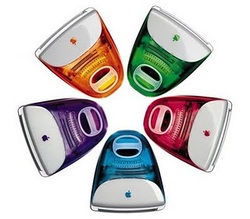
Standing out from the crowd
As awareness of branding grows and more businesses invest in their brand’s identity, colour is becoming more important for companies looking to differentiate themselves visually. Consider the success of Heinz Green ketchup. In the first seven months following its introduction more than 10 million bottles were sold. The result was the highest sales increase in the brand’s history, all because of a simple color change. Apple introduced colourful iMacs into a marketplace where colour had not been seen before. The Apple brand was the first to say, “It doesn’t have to be beige”. The iMacs reinvigorated a brand that had suffered $1.8 billion of losses in two years.
A World of Colour
Colour also provides communication cues for brand attributes such as traditional or cutting edge, calm or excited, as well as cultural cues, cues about environmental credibility, cues about political affiliations and a plethora of other meanings. In the world of brand design, choice and use of colour provides the potential for a wealth of carefully crafted and powerfully communicated messages about your brand.
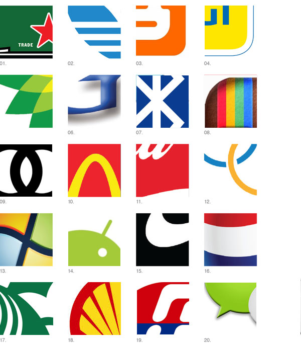
Recognisable Brands Test
Most of the most recognisable brands in the world rely on colour as a key factor in their instant recognition. Below are snapshots of twenty of the world’s most recognisable brand marks cropped to show a clear representation of their brand colours, but only a fraction of their logotype of symbol. Test yourself to see how many of the brands you can identify with colour being the primary visual driver.
As awareness of branding grows and more businesses invest in their brand’s identity, colour is becoming more important for companies looking to differentiate themselves visually. Consider the success of Heinz Green ketchup. In the first seven months following its introduction more than 10 million bottles were sold. The result was the highest sales increase in the brand’s history, all because of a simple color change. Apple introduced colourful iMacs into a marketplace where colour had not been seen before. The Apple brand was the first to say, “It doesn’t have to be beige”. The iMacs reinvigorated a brand that had suffered $1.8 billion of losses in two years.
A World of Colour
Colour also provides communication cues for brand attributes such as traditional or cutting edge, calm or excited, as well as cultural cues, cues about environmental credibility, cues about political affiliations and a plethora of other meanings. In the world of brand design, choice and use of colour provides the potential for a wealth of carefully crafted and powerfully communicated messages about your brand.
Recognisable Brands Test
Most of the most recognisable brands in the world rely on colour as a key factor in their instant recognition. Below are snapshots of twenty of the world’s most recognisable brand marks cropped to show a clear representation of their brand colours, but only a fraction of their logotype of symbol. Test yourself to see how many of the brands you can identify with colour being the primary visual driver.
WEEK 6
Colours of light
Light is made up of wavelengths of light, and each wavelength is a particular colour. The colour we see is a result of which wavelengths are reflected back to our eyes.
Visible light
Visible light is the small part within the electromagnetic spectrum that human eyes are sensitive to and can detect. Visible light waves consist of different wavelengths. The colour of visible light depends on its wavelength. These wavelengths range from 700 nm at the red end of the spectrum to 400 nm at the violet end.White light is actually made of all of the colours of the rainbow because it contains all wavelengths, and it is described as polychromatic light. Light from a torch or the Sun is a good example of this.
Light from a laser is monochromatic, which means it only produces one colour. (Lasers are extremely dangerous and can cause permanent eye damage. Extreme care must be taken to ensure that light from a laser never enters someone’s eyes.)
Colour of objects
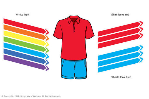
Objects appear different colours because they absorb some colours (wavelengths) and reflected or transmit other colours. The colours we see are the wavelengths that are reflected or transmitted.
For example, a red shirt looks red because the dye molecules in the fabric have absorbed the wavelengths of light from the violet/blue end of the spectrum. Red light is the only light that is reflected from the shirt. If only blue light is shone onto a red shirt, the shirt would appear black, because the blue would be absorbed and there would be no red light to be reflected.
White objects appear white because they reflect all colours. Black objects absorb all colours so no light is reflected.
Visible light
Visible light is the small part within the electromagnetic spectrum that human eyes are sensitive to and can detect. Visible light waves consist of different wavelengths. The colour of visible light depends on its wavelength. These wavelengths range from 700 nm at the red end of the spectrum to 400 nm at the violet end.White light is actually made of all of the colours of the rainbow because it contains all wavelengths, and it is described as polychromatic light. Light from a torch or the Sun is a good example of this.
Light from a laser is monochromatic, which means it only produces one colour. (Lasers are extremely dangerous and can cause permanent eye damage. Extreme care must be taken to ensure that light from a laser never enters someone’s eyes.)
Colour of objects
Objects appear different colours because they absorb some colours (wavelengths) and reflected or transmit other colours. The colours we see are the wavelengths that are reflected or transmitted.
For example, a red shirt looks red because the dye molecules in the fabric have absorbed the wavelengths of light from the violet/blue end of the spectrum. Red light is the only light that is reflected from the shirt. If only blue light is shone onto a red shirt, the shirt would appear black, because the blue would be absorbed and there would be no red light to be reflected.
White objects appear white because they reflect all colours. Black objects absorb all colours so no light is reflected.
Color Systems - RGB & CMYK
RGB or CMYK?
The color systems used by scientists and artists are entirely different. An artist will mix blue and yellow paint to get a shade of green; a scientist will mix green and red light to create yellow. The printed page in a magazine is yet another system.
It's important to define the two different kinds of color that we see in the world as the first step in understanding color systems. First, there's the color you can touch, such as the skin of an apple or a painted wall. These colors are part of the surface of an object. Next, there's the color you can't touch, such as a beam of red light and the colors produced by your computer monitor. Colors generated by light are part of one color system. The tangible colors which are on the surface of objects or on the printed page are another color system.
The following illustrations and descriptions define the different color systems.
Additive Color System
Red - Green - Blue (RGB)
Red - Green - Blue (RGB)
Mixing colours of Light
The primary colours of light are red, green and blue. Mixing these colours in different proportions can make all the colours of the light we see. This is how TV and computer screens work. If you look at a screen with a magnifying glass you will be able to see that only these three colours are being used. For example, red and green lights are used to make our brain perceive the image as yellow.
When coloured lights are mixed together, it is called additive mixing. Red, green and blue are the primary colours for additive mixing. If all of these colours of light are shone onto a screen at the same time, you will see white.

Scientists recognize the light primaries of red, green and blue.
This color model is used in computer monitors, television sets, and theater. If you put your eye up against your television screen you might something like the illustration below. Red, green and blue dots of light are creating the image.
This system applies only to devices employing light, such as computer monitors and television sets. RGB color space or RGB color system, constructs all the colours from the combination of the Red, Green and Blue colors.The red, green and blue use 8 bits each, which have integer values from 0 to 255.
Subtractive Color System
Red - Yellow - Blue
Red - Yellow - Blue


Most artists recognize red, yellow and blue as the 3 basic primary colors. These primaries are the pure colors which can not be created by mixing any other colors. Secondary hues are the result of mixing any of the two primaries. Tertiary colors result from mixing the secondary hues.
In subtractive color theory, all colors mix to yield black. Link to "How the Eye Sees Color" for more information about why this color system is subtractive.
In subtractive color theory, all colors mix to yield black. Link to "How the Eye Sees Color" for more information about why this color system is subtractive.
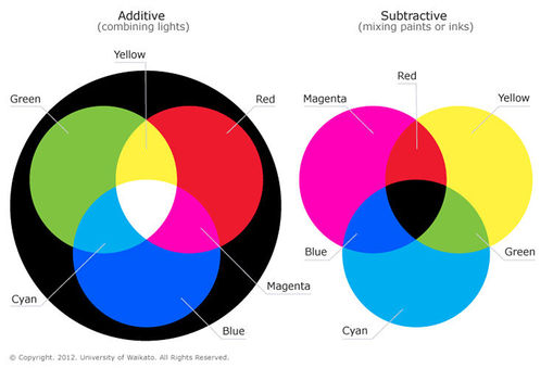
The CMYK Color System
Cyan - Magenta - Yellow - Black

In the print industry, cyan, magenta, yellow and black are used as the primary colors. When you mix all the colors, the result is gray. If you look at a printed page with a magnifying glass you might see something like the illustration below.

